“In the world of UX, immediate interaction is the key to unlocking a user’s heart.”
You’re a designer looking at your computer, attempting to construct a user interface that doesn’t make users scream in anger. Buttons, colors, and grids are flying around like confetti at a New Year’s Eve celebration. And just when you think you’ve solved the UX code, you realize that your user interface has all the appeal of a cranky cat on a gloomy Monday. That’s when the Doherty Threshold comes in like a UX superhero to save the day!
But what is the Doherty Threshold? It is the term obtained from a research article released in 1982 by Walter J. Doherty and Arvind J. Thadani while they were working at IBM. Their report established the criteria for computer reaction time at 400 milliseconds, rather than the previous norm of 2,000 (2 seconds). When a human order was conducted and produced an answer in less than 400 milliseconds, it surpassed the threshold. The consumers were deemed to find such mobile apps “addictive.”
So brace in, my UX friends, as we go through the lovely and little crazy realm of user experience with “The Doherty Threshold to Improve Performance: Laws of UX.” Let’s make UX great again, one click at a time!
What is Doherty Threshold:
“Productivity soars when a computer and its users interact at a pace (<400ms) that ensures that neither has to wait on the other.”
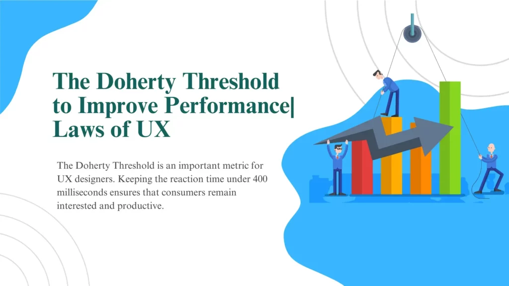
The Doherty Threshold is an important metric for UX designers. Keeping the reaction time under 400 milliseconds ensures that consumers remain interested and productive. This results in a favorable experience. Understanding and utilizing threshold will be critical for building successful human-computer interactions as we move into an era of ever-faster technology.
It is not only about developing quick systems, but also about systems that respect and accommodate human psychology. It’s about recognizing that the difference between a user feeling engaged and productive and a user feeling annoyed and disengaged can be measured in fractions of a second.
By following the threshold, UX designers of a web development company may help reduce the uncomfortable impression of waiting, producing experiences that seem instantaneous and fluid. They can improve not only user pleasure and engagement but also productivity.
Benefits of Meeting the Doherty Threshold
The Doherty Threshold is a user experience (UX) design concept that refers to the impression of user happiness and productivity in interactive systems based on reaction times. Meeting the threshold can provide a number of advantages for UX, including:
Improved User Satisfaction and productivity:
Meeting the Doherty Threshold usually signifies that user interactions with a system are rapid and responsive. This increases user satisfaction since people believe the system is efficient and effective. Users may finish activities more rapidly with faster response times, resulting in higher productivity. While waiting for the system to reply, users are less likely to feel frustrated or distracted, which can lead to more productive work.
Reduced Cognitive Load and higher Engagement:
When a system reacts quickly, users no longer have to keep track of where they are in an activity, which reduces cognitive burden. This makes the interaction more natural and less intellectually exhausting. It results in a more pleasant user experience. Meeting the Doherty Threshold can encourage users to interact more with a system or application. It increases their likelihood of exploring its features, completing tasks, and utilizing its capabilities.
Positive Brand Perception:
A timely and efficient user experience adds to a favorable brand image. When users enjoy a seamless and hassle-free experience, they are more inclined to regard a web development company or product favorably. When a system responds, users are more likely to perform tasks effectively. This is especially significant in e-commerce, software programs, and other sectors where task completion is a primary aim. Slow and sluggish systems frequently lead to users leaving their work or possibly the system entirely. Meeting the threshold helps to minimize abandonment rates, maintaining users and prospective customers.
Enhanced Usability and accessibility:
Mobile apps that satisfy the Doherty Threshold are frequently more useable and user-friendly. This is so because they require less effort and time to operate properly. This is critical for both onboarding new users and maintaining old ones. Systems that are quick and responsive are more accessible to a larger range of users. It includes those with impairments or elderly people who may need more time to accomplish tasks.
Challenges and Considerations
Meeting the Doherty Threshold in UX design brings many difficulties and concerns. System performance must be optimized, which can be resource-intensive. It may need trade-offs in terms of functionality or visual design. Threshold is a difficult effort to balance performance with other design components while still fulfilling user expectations. It presupposes that users have consistent and dependable hardware and network connections. This is not always the case, making creating a consistent user experience difficult. It is critical to examine the trade-off between responsiveness and energy use, especially on mobile devices. It varies according to the job and user demographics. Therefore recognizing user requirements and adjusting the UX accordingly is critical. Attaining the threshold necessitates a careful mix of technology optimization, user-centric design, and real-world factors for the web development company
Tips for Designing with the Doherty Threshold in Mind
When a web development company designs with the threshold UX in mind, responsiveness and user pleasure are prioritized. Consider the following suggestions to help you get there. Concentrate on performance improvement by simplifying code, removing extraneous animations, and lowering latency. Then, undertake extensive user testing to determine how users interact with your system and what their response time expectations are. Make your design to suit these requirements. Prioritize simplicity and usefulness in your interface, making tasks plain and simple for users. Consider adaptive design approaches to allow for variable device capabilities and network circumstances. Monitor your system’s performance on a regular basis and gather user input to make iterative changes. Remember that the threshold might change as technology progresses. So staying up to current with industry standards and best practices is critical for constantly offering a responsive and user-friendly experience.
Applications of the Doherty Threshold
Case Study 1: Amazon
Amazon, the world’s largest online retailer, has adopted the Doherty Threshold’s guiding principles to improve customer experiences. Amazon’s one-click shopping function is one of the key reasons for its success. This function allows registered customers to buy something with only one click. It bypasses several processes and surveys.
Amazon significantly improves the shopping experience by lowering the number of clicks necessary to make a transaction. The Doherty Threshold Laws of UX emphasis on decreasing user wait times and improving productivity is consistent with this.
Amazon uses machine learning algorithms to propose things to consumers, reducing the time spent looking for items and boosting the shopping process’s efficacy. Amazon has created an engaging and user-friendly e-commerce platform that draws repeat customers by following these methods.
Case Study 2: Google Search
One of the most powerful company that adheres to this approach is Google. Keeping the UI as basic as possible so that users can find what they’re looking for without becoming distracted by extra elements like the navigation bar, footer, or animation. Because computers are so powerful, search results are delivered in milliseconds. The primary goal of Google’s search engine is to provide users with super-fast search results. Google understands that people seeking information online value efficacy and speed.
Google constantly optimizes its computers and algorithms to give search results in milliseconds. The simple design of the Google search site allows users to complete their inquiries fast and with minimal distraction. Google consistently surpasses consumer expectations by emphasizing speed and response. Google’s dominance in the search engine market is primarily due to its commitment to the Doherty Threshold.
Final Thoughts:
In the realm of UX design, where acronyms and jargon dominate the day, there’s a new hero on the block: the Doherty Threshold! It’s the supercharged, turbo-charged, and caffeinated cousin of the UX universe. We’ve realized that if we want our users to stick around, we need to be as sharp as a squirrel on an espresso binge. Seriously, if your website or app takes longer to load than it does for me to pick what to wear on a Monday morning, you’re in big trouble! So, what have we learned on this pleasant voyage through the Laws of UX? It is the golden ticket to the Wonka Factory of user delight. Responsiveness is the key to keeping people interested, pleased, and from tearing their hair out in frustration. Meeting this benchmark by a web development company isn’t simply a suggestion; it’s a user experience commandment!