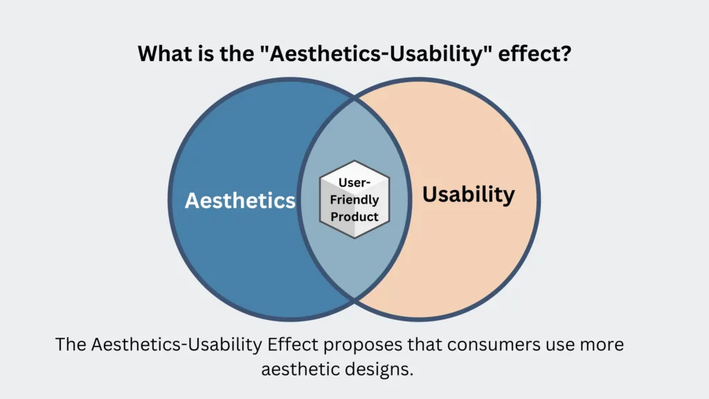
The Aesthetics-Usability Effect proposes that consumers use more aesthetic designs. These are simpler to use and more practical. In other words, for the user, an appealing product or interface means a better web design. During the 1980s and 1990s, researchers studied the link between aesthetics and usability. Some early research revealed that aesthetics might have a favorable influence on usefulness.
The Aesthetics-Usability Effect continues to be an essential point in web design and user experience. It emphasizes the need for designers to create both appealing and practical products. This effect is necessary to combine aesthetics with usability and undertake usability testing. It will guarantee that a design satisfies the needs and expectations of its target audience.
So, we can say that it’s like the magic trick of the design world. The effect that makes something look great for the users. It can trick our brains into thinking it works better, even if it doesn’t!
Buckle up because we’re about to dive into the quirky world of the Aesthetics-Usability Effect.
Aesthetic-usability effect in design:
The Aesthetics-Usability Effect is a significant phenomenon in the field of UI/UX. It is used by most of the web development company. The visual attractiveness of an interface has a significant influence on how people perceive and engage with a product. These phenomena were investigated by Kurosu and Kashimura in 1995. It has remained a core idea in human-computer interaction ever since.
The Aesthetics-Usability Effect demonstrates that people perceive that appealing things are more useable. This enticing cognitive bias is not confined to aesthetics. It also extends to the emotional connection between users and the visual aspects of an interface. The pleasant emotional reaction elicited by a well-crafted design frequently. It overshadows small usability difficulties, enabling consumers to view the product as easier to use than it is.
One key takeaway is that the visual usability impact is not a cure-all for all usability issues. While it may make consumers more tolerant of minor faults, it does not compensate for serious usability defects. The underlying notion of form and function working in tandem is unbreakable. A beautiful interface may entice consumers if they cannot discover what they need or do their jobs. They will most certainly quit the product.
Principle of design Aesthetics-Usability effect:
This effect demonstrates that customers are prone to view well-designed things as more intuitive and useful. It is applicable even if the actual usability is not superior to less pleasing alternatives. This cognitive bias can have a large impact on how people interact with a product. It is mainly influenced by an emotional response to design,
Apple’s success serves as a compelling example of how aesthetics can build consumer loyalty and positive sentiments. Pleasing designs catch users’ attention. It also makes them more tolerant of small technological flaws, adding to a favorable long-term user experience.
Detecting and evaluating instances of the aesthetic-usability impact is a key skill for designers in user research. Positive remarks on aesthetics may hide usability difficulties. A web designing company must negotiate this treacherous terrain. They can compare what people do with what they say during usability testing. Understanding the three options for favorable remarks about aesthetics. These are pressure to comment, pressure to be kind, and the actual presence of the aesthetic-usability effect. Let designers handle these challenges and overcome all the possible problems.
Balancing Aesthetics and Usability:
The interaction between aesthetics and usability is the foundation of efficient UI/UX design. Prioritizing a user-centered approach and knowing human demands is the first step in creating interfaces. These not only look good but also connect with the user’s inner goals and ambitions. Simplicity is achieved by decluttering and information prioritization. It offers an intuitive design that assures users can browse and interact with the interface.
Consistency is a consistent dedication to visual and interaction harmonious patterns. It improves the user experience by adding regularity and comfort. The continuous cycle consists of regular iteration based on user input and behavioral insights. It enhances and refines the aesthetics and usefulness. As a result, the design must be in sync with changing user expectations.
Micro-interactions provide a delightful and guiding aspect to the user experience. It improves the interface’s visual attractiveness as well as its usefulness. The balance between aesthetics and usefulness emerges as the key to attracting people in this comprehensive approach. It ensures that their digital journey is visually appealing and operationally flawless. Designers may construct digital experiences using this balance. These connect with and satisfy their consumers’ requirements, resulting in great UI/UX designs.
Aesthetics-Usability Effect Examples:
- Apple: Apple’s website is known for its elegant and minimalist design, showcasing the aesthetic usability effect by combining functionality with aesthetics.
- Airbnb: Airbnb’s website features a clean and visually appealing layout that promotes user-friendly navigation, making it easy for users to find and book accommodations.
- Pinterest: Pinterest’s platform relies on visually appealing images and layouts, providing an intuitive and aesthetically pleasing user experience.
- Squarespace: As a website builder, Squarespace emphasizes functionality and aesthetics, allowing users to create visually stunning websites.
- Behance: Behance, a platform for creative professionals, showcases the work of artists and designers in an aesthetically pleasing manner, emphasizing the importance of visual appeal.
- Nike: Nike’s website combines sleek design with user-friendly navigation to create an immersive shopping experience for its products.
- Spotify: Spotify’s music streaming platform employs a visually engaging design and user-friendly features, enhancing the overall user experience.
- Vimeo: Vimeo is a video-sharing platform emphasizing high-quality video content and a visually appealing user interface, making it user-friendly for creators and viewers.
Challenges and Considerations in Aesthetics-Usability effect:
The Aesthetics-Usability Effect comes with its own set of obstacles and issues. However, it is a strong tool for improving user experiences. One of the most difficult issues is that what is regarded as pleasant can be very subjective, shifting from person to person. As a result, developing a design that is appealing to everyone might be tough. Emphasizing aesthetics over utility might lead to usability concerns. The visual appeal should complement, not compromise, usefulness. It is critical to strike a balance between aesthetics and practicality.
Another factor to consider is the continual need for adaptability and evolution as design trends change. What is appealing now may not be so in a few years. Thus, websites and goods must keep up to date. Accessibility is a significant challenge. Aesthetic decisions that exclude people with disabilities can lead to exclusion. The aesthetic usability impact can improve user experience and engagement. It necessitates a careful approach that balances the subjective aspect of aesthetics with the necessity for practical and inclusive design.
Conclusion:
The Aesthetic Usability Effect might be the secret ingredient that transforms a mundane user interface into a joyful user experience with fun. It’s similar to adding a colorful umbrella to your drink. It doesn’t affect the taste, but it enhances the experience. So, while creating websites and apps, remember that aesthetics may go a long way toward making consumers grin as they click, scroll, and navigate. Who said usability couldn’t be as lovely as a well-placed joke in a user manual? A memorable and successful user experience is defined by the beauty in functioning, the charm in design, and the hilarity in interaction.